
How to Build Pricing Card Component with a Toggle Switch in Bricks Builder (Using Data Attributes)
Creating interactive pricing tables is a staple for modern SaaS and agency websites. The standard monthly/yearly toggle is expected, but building one that feels smooth and professional in Bricks Builder often leaves people stuck.
In my latest tutorial, I walk you through exactly how to build a dynamic pricing component from scratch. We aren’t just using standard widgets; we are diving into CSS variables, custom BEM classes, and the power of data attributes combined with Bricks Interactions.
Here is a complete breakdown of the process.
Structure and Clean Classes (BEM)
When building a custom component, your HTML structure dictates how easy your life will be when you start styling.
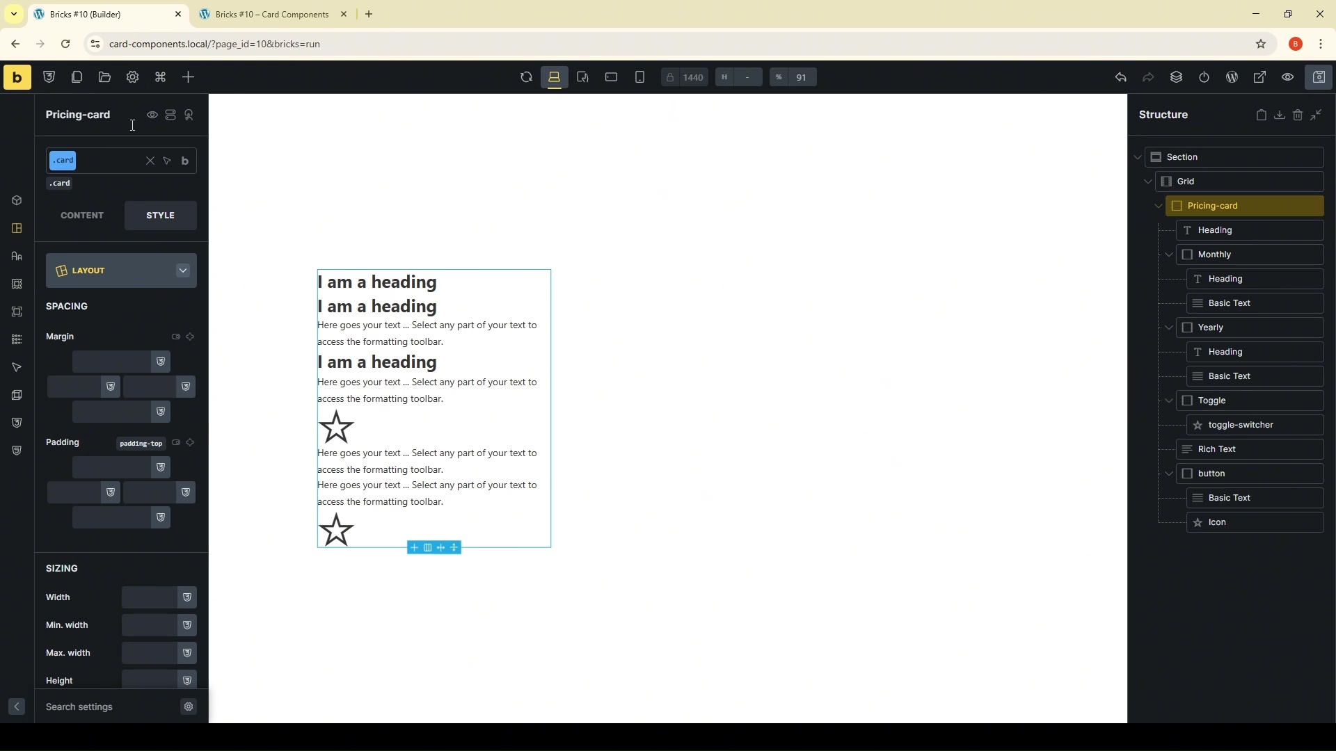
The DOM Structure
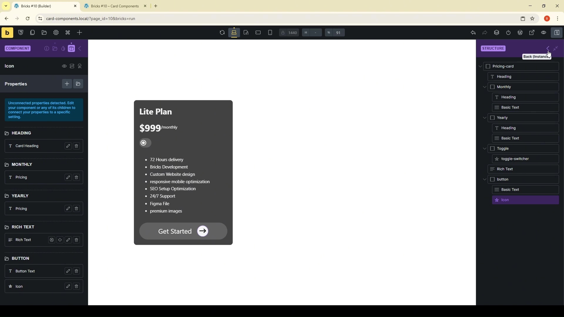
Here is how your structure panel should look. We are creating a container to hold our cards, and each card has distinct sections:
{Div} Card Wrapper (.card)
-
Heading (
.card__heading) -
{Div} Monthly Pricing Block (
.monthly) -> Holds the monthly price.- Heading (
.monthly__heading) . - Basic Text (
.monthly__text) .
- Heading (
-
{Div} Yearly Pricing Block (
.yearly) -> Holds the yearly price.- Heading (
.yearly__heading) . - Basic Text (
.yearly__text) .
- Heading (
-
{Div} Toggle Wrapper (
.toggle) -> The container for our switcher.-
Toggle Icon (
.toggle__switcher) -> The element that moves.
-
-
Features/Rich Text
-
{Div} Button Wrapper (
.btn)- Basic Text (
.btn__text) . - Button Icon (
.btn__icon) .
- Basic Text (
Setting the Stage with Variables & Styling
Consistency is key to modern UI. Instead of picking colors and padding values manually for every element, we are going to leverage Bricks Builder's built-in Style Manager.
Using the Style Manager for Spacing
I start by generating global spacing variables. In the video, I show you how to generate a set (S, M, L) that we can use throughout the build.

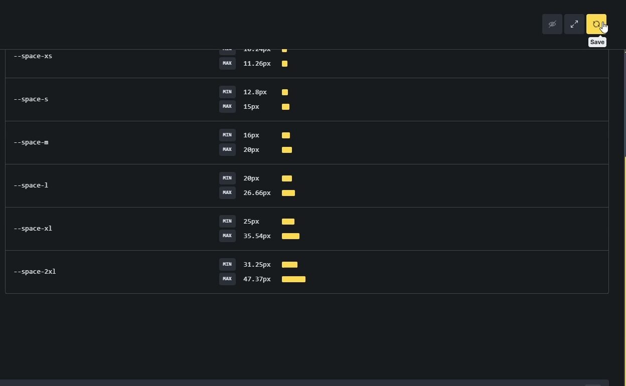
When styling the main .card class, we won't type "20px." We will select our variable: space-mid. This ensures that if we ever want to change the padding on all cards, we do it in one place.
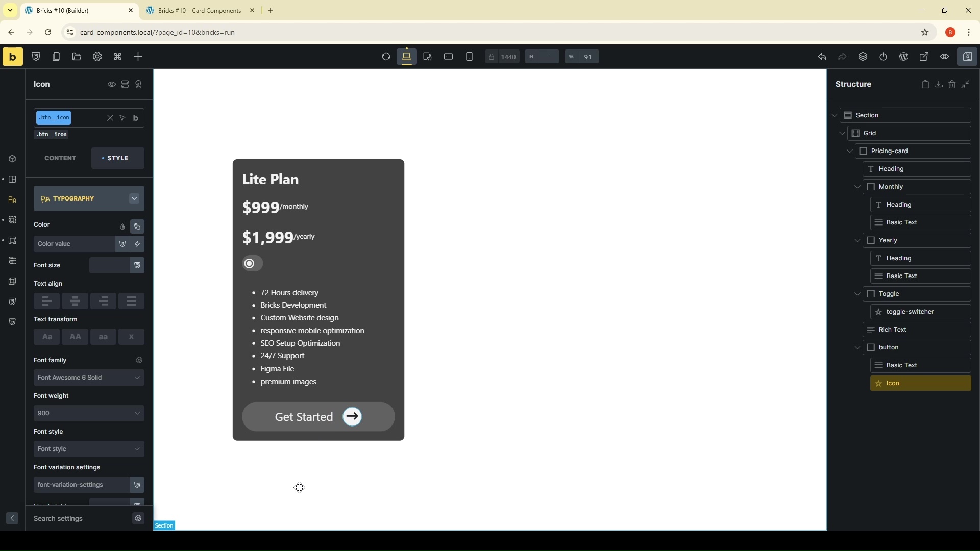
For the styling, we are aiming for a sleek, clean look:
-
Grid: We use a CSS grid container to align our multiple cards cleanly.
-
Border Radius: Rounded corners on the card and the button give it a modern feel.
-
Color Palette: We are using dark backgrounds with light text for that professional “Glassmorphism” vibe.
-
Button Hover: We want interactivity. On the button, we add a simple transition effect where the arrow icon shifts to the right on hover.
Data Attributes & Display Logic
This is where the actual functionality happens. We need a way to tell Bricks: "When the toggle is in position A, show Monthly. When in position B, show Yearly."
Instead of complex JavaScript, we use CSS Data Attributes.
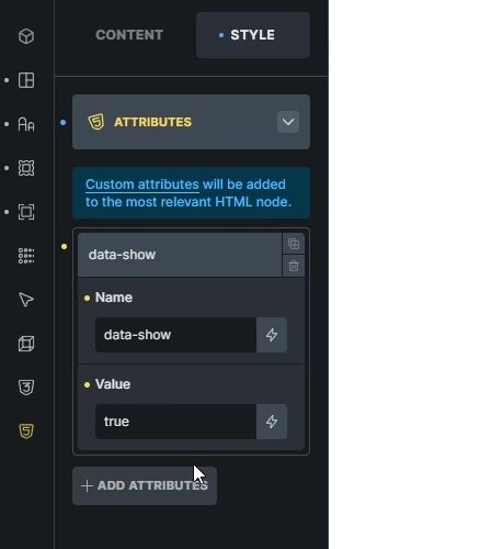
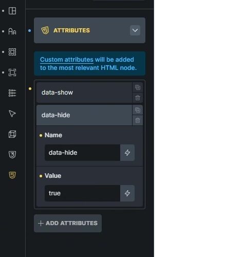
Setting Up the Attributes
First, select your main .card wrapper and go to the “Attributes” tab. We will add two attributes:
-
Attribute Name:
data-show| Value:true -
Attribute Name:
data-hide| Value:true
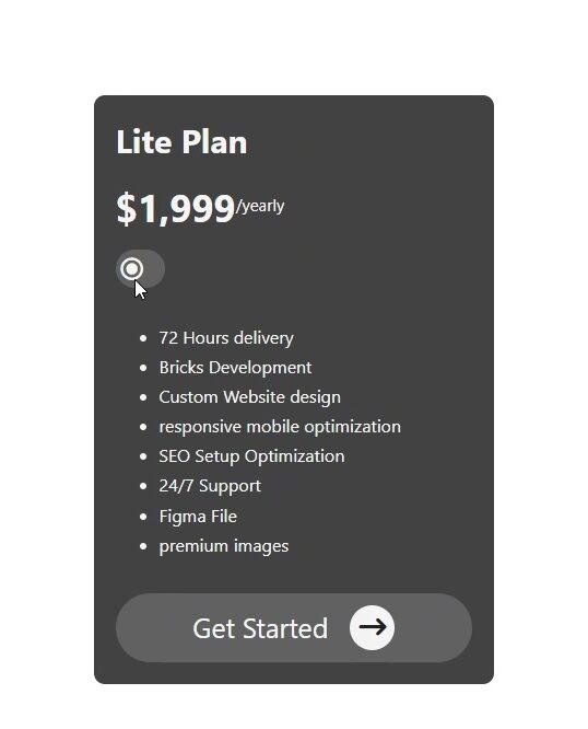
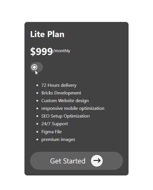
By default, we will set the yearly price block (.yearly) to be hidden.
The CSS for Toggle Logic
Now we need a tiny snippet of Custom CSS to make these attributes work. We add this to each of Monthly/Yearly custom CSS panel:
/* Custom CSS for Toggle Logic */
/* This is for Monthly */
root [data-hide="true"] {
    display: none;
}
/* This is for Yearly */
root [data-show="true"] {
    display: flex; /* Or display: block; depending on your needs */
}
Connecting the Toggle with Bricks Interactions
The structure is there, and the CSS logic is ready. The final step is to make the toggle button do something. We use Bricks Interactions.
The Click Trigger
Select the Toggle Wrapper (.toggle). This is the element the user will click.
-
Trigger: Click
-
Action: Toggle Attribute
-
Key:
data-show| Value:true -
Target: (CSS Selector)
.yearly
Now, duplicate that interaction, but change the logic for the monthly block:
-
Trigger: Click
-
Action: Toggle Attribute
-
Key:
data-hide| Value:true -
Target: (CSS Selector)
.monthly
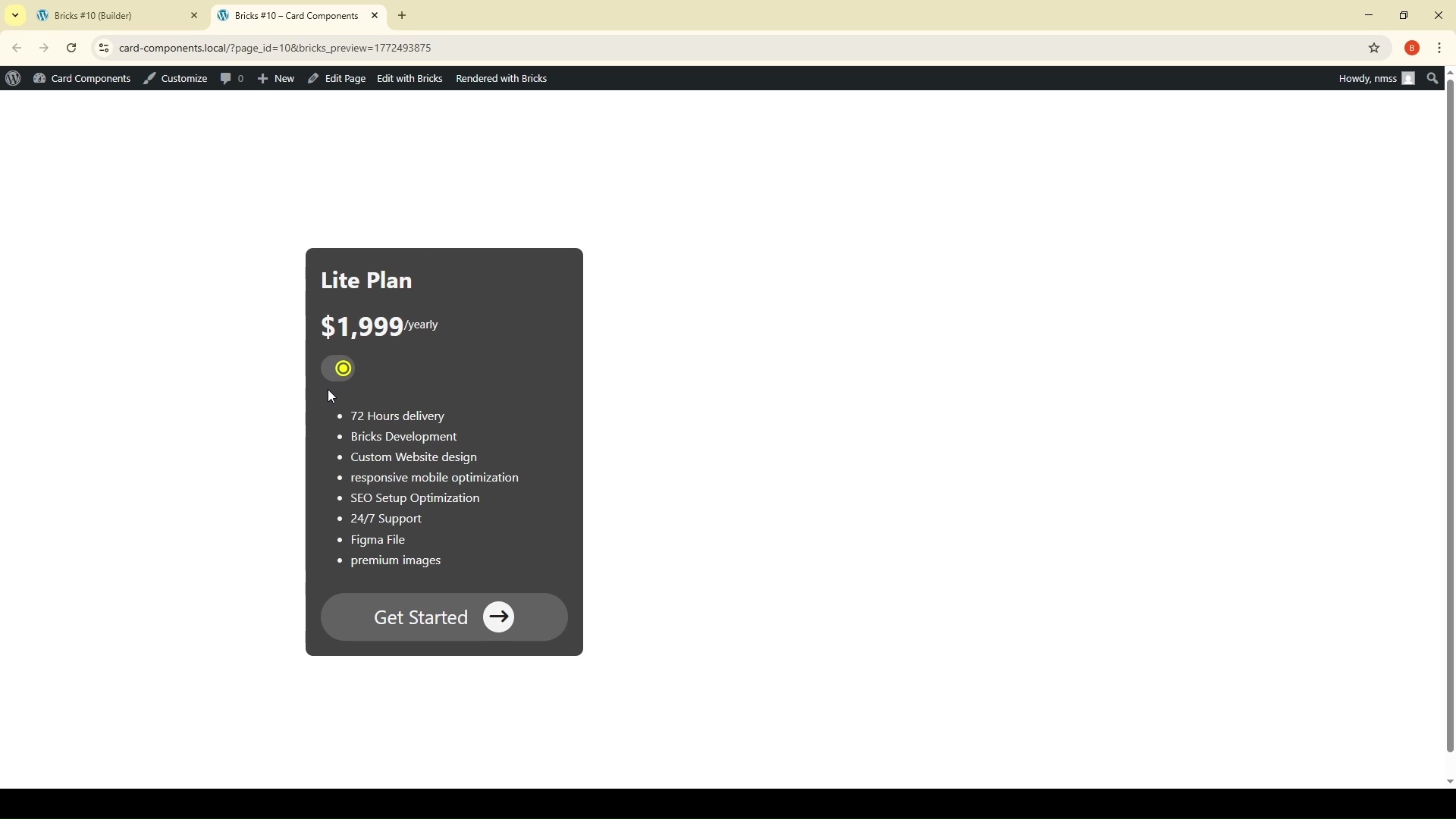
Now, when you click the toggle in the frontend, the yearly price will appear, and the monthly will disappear!
Animating the Switcher
We also want the little switch icon itself (.toggle__switcher) to move smoothly. We use a combination of a CSS utility class and interaction.
First, add this minimal CSS to your toggle wrapper:
/* Style for the active state of the switcher icon */
.active-color {
    color: #ffeb3b; /* Example active color (yellow) */
    transform: translateX(1.5rem); /* Move the icon to the right */
}
Finally, add one more interaction to the Toggle Wrapper that toggles this .active-color class on the switcher icon itself when clicked. This gives us that beautiful sliding animation.
Converting to a Component
You’ve built a powerful tool, but you don't want to recreate this interaction every time you need a new pricing table. We need to turn this into a Bricks Component.
Component Properties
In Bricks, select your completed card and click "Create Component." The true power comes from mapping fields to Component Properties.
-
The Card Heading (
.card__heading) -
Monthly Price (
.monthly .price) -
Yearly Price (
.yearly .price) -
Button Text
Once mapped, you can drop this component onto any page, and you will see simple input fields in the sidebar to change the prices and text without ever opening the actual template again. It’s an incredibly fast workflow for client sites.
Wrapping Up
By using CSS data attributes combined with Bricks Builder's native Interactions and Components, you can build highly complex, interactive UI elements without sacrificing page speed or relying on third-party plugins.
Your DOM stays clean, your CSS is modular, and your workflow becomes significantly faster.
Did you find this tutorial helpful? Let me know in the comments
Don’t forget to subscribe to the channel for more advanced Bricks Builder workflows!t